

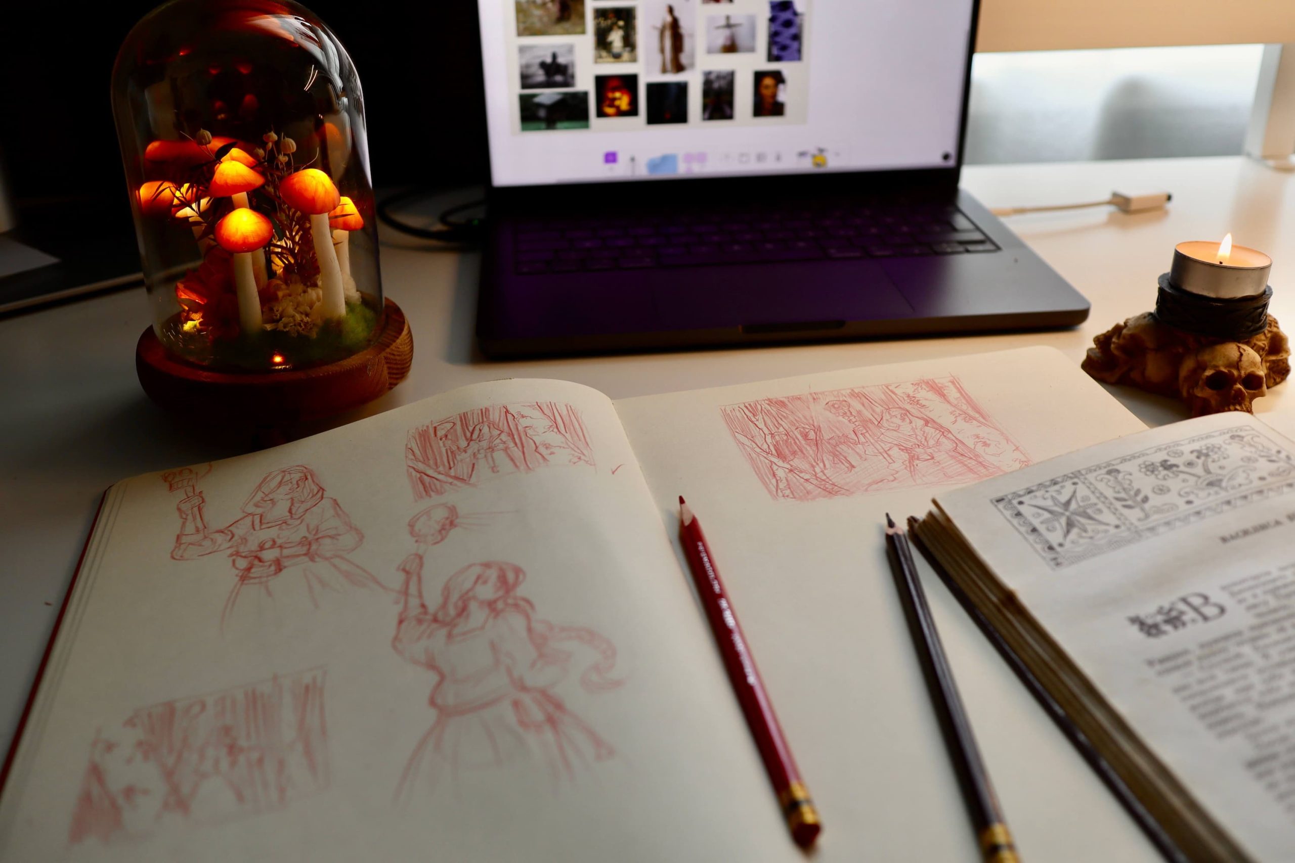
Have you ever found a beautiful reference, started painting it, and then realised that something wasn't really working? The problem is that a beautiful reference doesn't necessarily make a good painting. Sometimes, we need to rearrange or simplify the composition to bring out the qualities that made us want to paint this subject in the first place.
That's where thumbnail sketches can come in handy. Thumbnails are small drawings—although they can be done in paint too—that allow us to experiment with different compositions and work out potential problems before committing to a larger piece. They're an important part of my painting process, whether I'm working from a reference or from imagination.
In this article, I'll walk you through how to use thumbnail sketches to improve your painting composition, with practical examples from my own work.
What Are Thumbnail Sketches and Why Use Them?
Thumbnail sketches are small, simplified drawings we can use to explore ideas and plan out the composition of larger artworks. They can be created using almost any medium, including paint and digital tools. Personally, I prefer using a pencil and my sketchbook because it's quick and accessible.
Thumbnails are usually quite small—no bigger than a few inches. This restriction is actually one of the biggest advantages of doing thumbnail sketches because it forces you to focus on the larger relationships in your picture, instead of getting bogged down in the details. Remember that the main purpose of thumbnail sketching isn't to create a beautiful, finished piece but to work out the composition.
Composition is one of the most important aspects of a painting, as it forms its underlying structure. It is how we arrange the elements of an artwork to create a unified design and guide the viewer's eye through the painting. Thumbnails allow us to plan these things before we start painting, as well as refine our ideas or improve the reference we're working from.
In Carlson's Guide to Landscape Painting, John F. Carlson makes an important distinction between copying what we see and creating an effective painting:
"[The artist] is really using nature and her forms, while he manipulates the natural truths to suit his artistic needs."
You don't have to reproduce everything exactly as you see it. If the painting benefits from it, by all means move things around, change their proportions, and simplify certain areas. Thumbnail sketches are a great way to explore these possibilities. Instead of copying your reference or committing to the first arrangement that comes to mind if you're working from imagination, you can try several variations and compare how well they work on a small scale.
How to Make Thumbnail Sketches
You don't need any fancy materials to get started with thumbnail sketching. A pencil and a piece of paper are more than enough, although you can also use practically any drawing or painting tool.
Let's go through the process of creating a thumbnail and using it to develop your painting's composition.
1. Decide What You Want to Emphasise
Before you start drawing, take a moment to consider what attracted you to your subject in the first place. Perhaps it's a particular lighting effect or an interesting silhouette. Identifying what makes the subject interesting will help you decide which elements should be emphasised.
This is closely related to the idea of a focal point: the area of a painting that we want to attract the viewer's attention. Not every painting needs a single focal point, but it's useful to establish a visual hierarchy. Which elements are the most important? Which ones are there to support them? And are there any unnecessary details that might distract from the main subject?
Let's take this reference as an example.
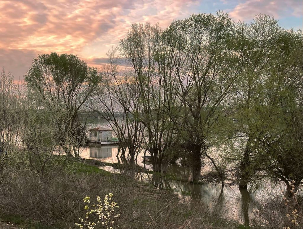
What I find most interesting about it is the shapes of the trees surrounded by water when the river is high. However, they seem a little disorganised, so in my thumbnail, I'll try to simplify their silhouettes to make them read better.
2. Establish the Main Shapes and Composition
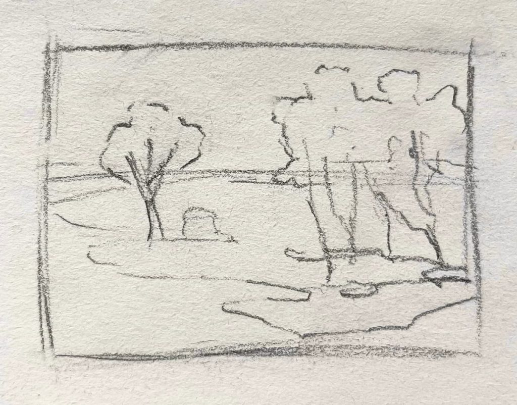
Start by drawing a small rectangle that represents the boundaries of your painting. If you've already decided on the dimensions of your final artwork, try to keep the proportions of the thumbnail roughly the same.
Next, use large shapes and main gesture lines to establish the main elements of the composition. Pay attention to how the major shapes relate to each other. Don't worry about the details or getting the drawing right.
At this point, you want to start assessing whether anything needs changing. Are there any repetitive shapes or lines that need more variety? Are some areas too crowded? Would the composition benefit from a change in the placement of the main elements?
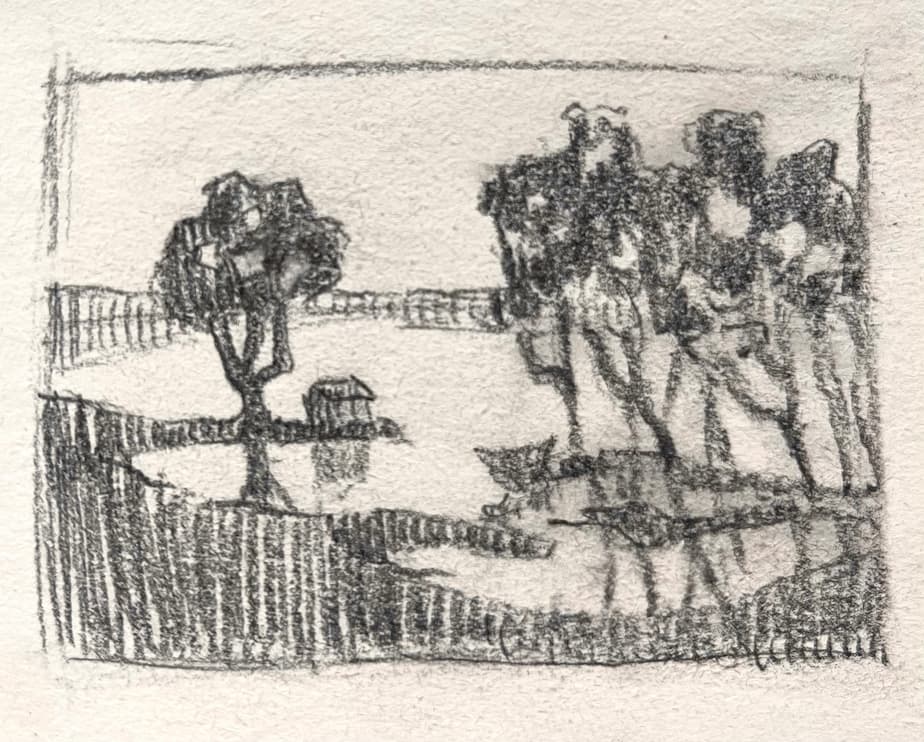
In my thumbnail, I wanted to simplify the composition, especially the arrangement of the trees. The house, being the only human-made element in this scene, naturally creates a strong focal point, so I created more space around it, letting the rest of the landscape "envelop it". At this point, I'm not worried about any details, focusing on the big shapes and their distribution within the picture frame.
3. Add Variety and Visual Interest
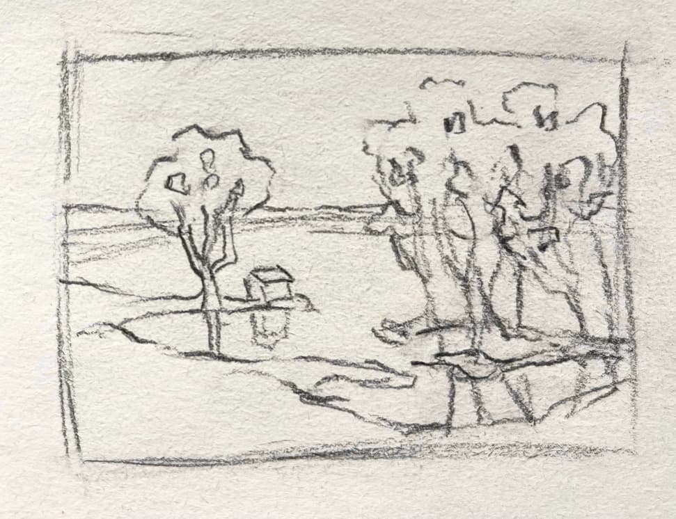
Now that we have established the backbone of the composition, we can start adjusting the shapes to make them more interesting. Look out for repetition! When shapes are too similar in size, character or spacing, they can make the composition feel monotonous. Introducing some variety can help create a more natural and visually interesting design.
This doesn't mean that you should start adding lots of detail. Instead, think about how you can vary the proportions and silhouettes of the main shapes while keeping the general design we established in the previous step intact.
At this stage, I focused on giving the trees in my thumbnail more character. I varied the curves of their branches and added some sky holes here and there. I also slightly adjusted the curves of the shoreline to create a more interesting rhythm throughout the composition.
The goal is to find a balance between unity and variety. In the previous step, we established a unified design, and now we want to add enough variation to it to keep the composition interesting.
4. Simplify the Value Pattern
Thumbnail sketches are a great tool for establishing the value pattern of an artwork. Value is how light or dark something is, and the arrangement of light and dark shapes plays an important role in the overall structure of a composition, helping us describe objects and establish visual hierarchy.
The problem is that the world around us contains an overwhelming amount of visual information. There is a myriad of subtle value transitions and tiny variations that can make it difficult to see the larger value relationships.
A great way to simplify this information is to squint at your reference. Squinting reduces our ability to distinguish smaller details and subtle value differences, making large value shapes easier to identify. You can also get a similar effect by blurring a photograph in an image editor.
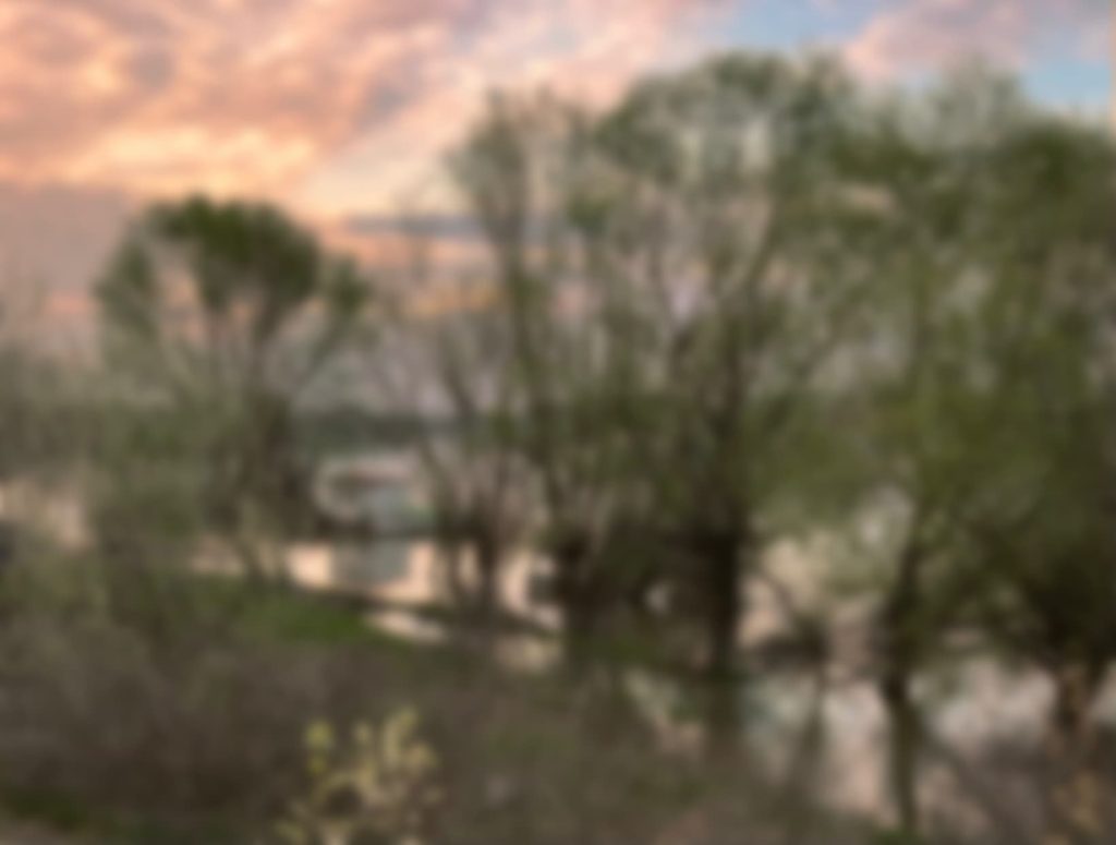
Once you've identified these value masses, try grouping similar values in your thumbnail. You don't need a lot of values; two or three are enough to communicate the base value structure. This will help you establish a clear pattern without getting distracted by all the subtle variations in your reference.
In this thumbnail, I made the foreground elements dark, the shoreline on the horizon a middle tone, and left the rest white.
5. Experiment with Different Compositions
You don't have to stop there—try experimenting with your composition by creating several thumbnails! One of the biggest advantages of thumbnail sketching is that you can explore different arrangements without investing too much time or effort in any particular one.
Try making three to five variations of the same subject. You can experiment with moving elements around or changing the crop of the picture frame.
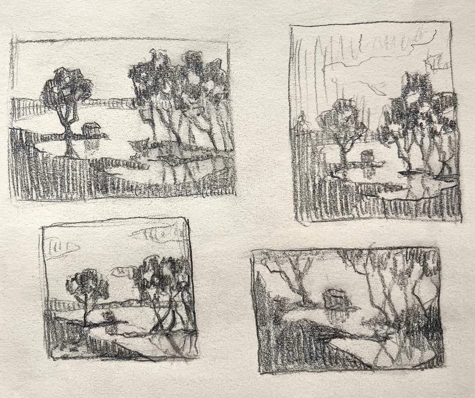
Now that you have several options, it's time to evaluate them. Here are a few questions I like to consider when choosing a composition:
- Is the focal point clear?
- Does the value pattern create a coherent structure?
- Does the composition feel balanced?
- Does the arrangement bring out the qualities that attracted me to the subject in the first place?
If one composition stands out but you're still not entirely happy with it, make another thumbnail to refine it further. You don't have to choose between your original options if you feel that there's room for improvement. The goal is to arrive at a composition that you're happy with and can confidently develop into a larger painting.
Next Steps
Once you've settled on a composition, you can start developing it into a more detailed preparatory drawing or move on to a colour study.
A colour study is a small preliminary painting that allows you to experiment with your colour scheme before starting the final artwork. One of the things I particularly like about combining thumbnails and colour studies when I plan out paintings is that they let me focus on different aspects of painting separately. Since I've already established the composition and main value relationships in the thumbnail, I can focus on just experimenting with colour.
In my colour study, I started with colours similar to those in the original reference but gradually introduced more pink, violet, and teal notes to enhance the atmosphere. I also compressed the value range while largely preserving the value pattern established in my thumbnail.
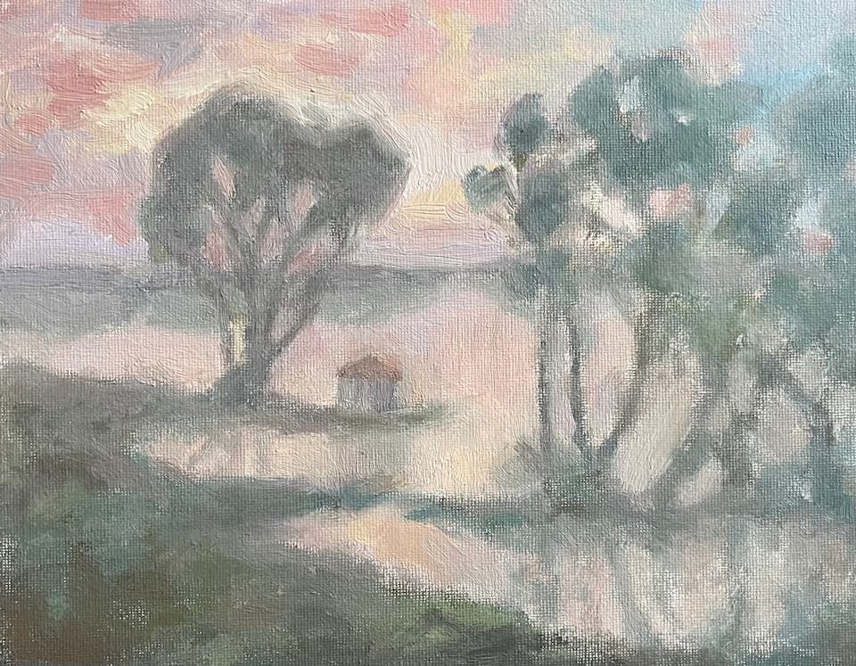
These adjustments helped me take the painting in a different direction, and I ended up pushing the colours and atmosphere even further in the final piece. Check out my article on landscape painting tips to learn more about how to paint landscapes like this.
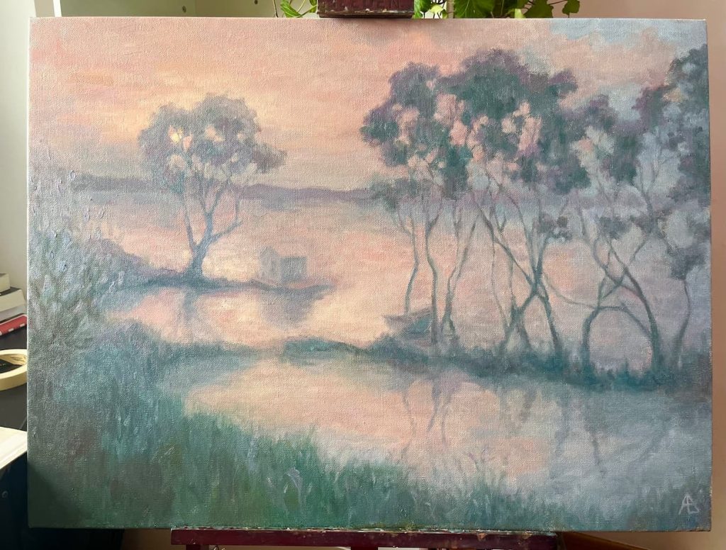
Of course, you won't always need to do all this work before you start working on your painting. The amount of preparation you need depends on the complexity of your subject and your personal painting process. But if you're working on something ambitious or struggling to translate your ideas into a finished painting, these studies can be incredibly helpful.
Conclusion
Thumbnail sketches are one of the easiest ways to improve your painting composition. They don't require any expensive materials and can be completed in a matter of minutes. They allow you to simplify complex subjects and explore different designs before you start painting.
Perhaps their greatest benefit is that they encourage us to think about the underlying structure of a painting rather than getting lost in small details.
If you'd like more structured practice with seeing and simplifying values, you can try one of the exercises from my upcoming oil painting workbook for beginners. It will teach you how to break down a complex subject into a handful of big value shapes.
You can download the exercise for free by joining the waitlist, and I'll let you know when the workbook is ready!
0 Comments